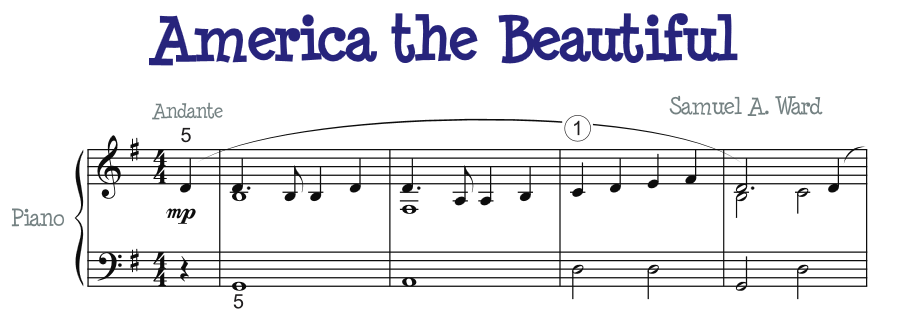
Musical Scores are Fantastic Diagrams
http://www.makingmusicfun.net/htm/f_printit_free_printable_sheet_music/america-the-beautiful-piano.htm
Musical scores convey very large amounts of information. Few common diagrams display such dense amounts of information.
A person could argue that DNA likewise conveys information, but size in reality is too small for easy reading, and even then, the information is basically binary.
Flowcharts can be like music, especially when the designers have the discipline to repeat common patterns.
Venn Diagrams
For a diagram to be useful, the diagram must present information in a manner emphasizes or sharpens some aspect of the data. For example, Venn diagrams can sharpen the relationship among several attributes or populations. When two populations overlap, the simple picture of two overlapping circles help convey the relationship. When three populations overlap, the Venn diagram has seven possible areas. The designer has the responsibility to identify the members of the populations in each area. For the reader, the diagram acts like short term memory; as the reader inspects each area, the reader has confidence--maybe implicitly-- that the other areas remain unchanged. Even when one of the areas is empty, the diagram can convey the information. In some cases, two diagrams can show changes that occur as a result of a change factor. Venn diagrams can handle two to four populations.
Truth Tables
Boolean logic can handle one to four attributes easily. The four sides of a rectangle can each handle one attribute. xxx1 When the number of attributes increases, the diagrams can morph from a rectangle to columns. xxxx
Truth Tables become Data
The rows each contain a list of values, usually binary. When the rows appear in counting order, the rows declare that all of the possibilities are covered. Sorting the rows can emphasize the commonality of values in certain columns. xxxx
Data Compression
A data table contains a lot of implied data. xxxx